.jpg)
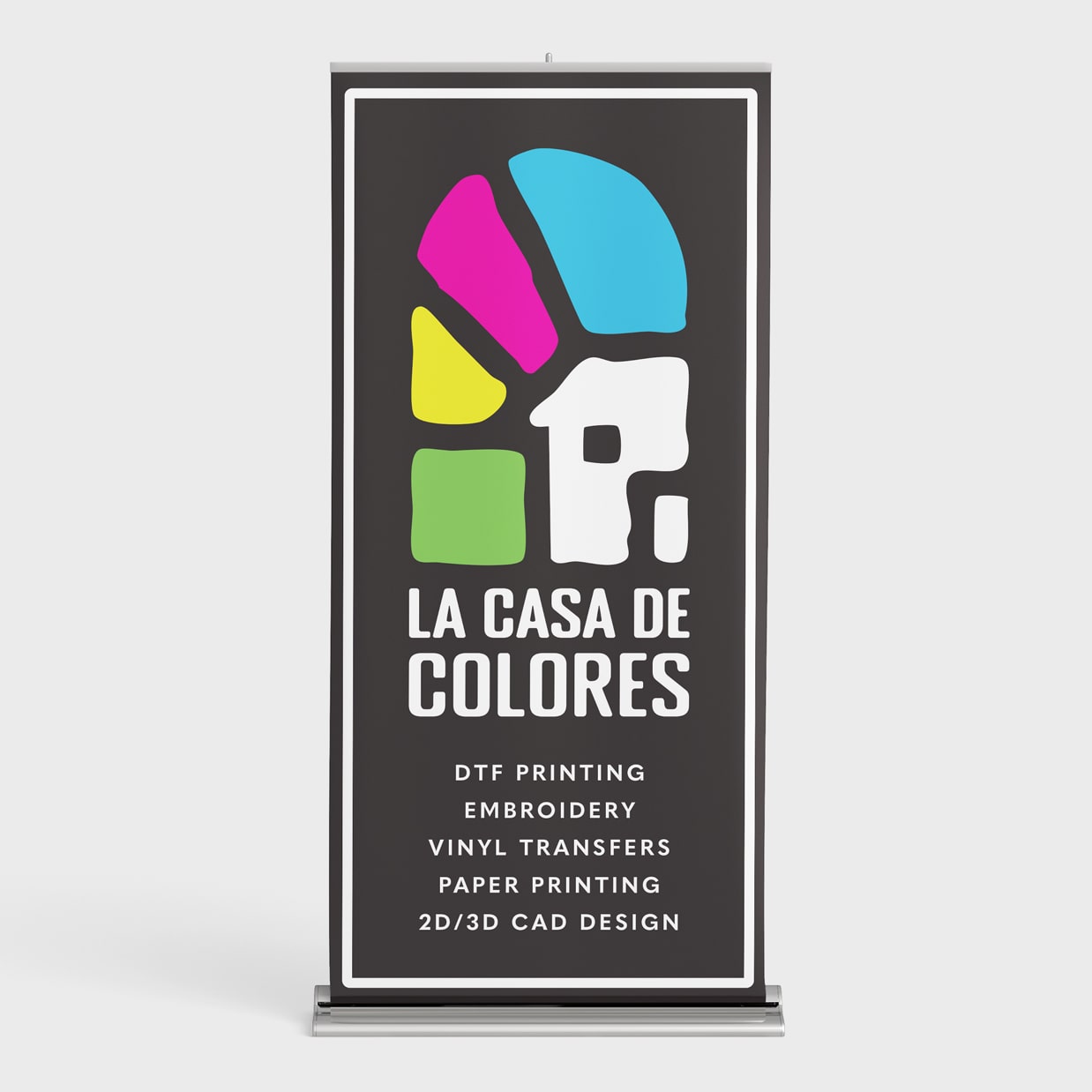
La Casa De Colores — “The House of Colors” — is a screen printing studio created with heart, heritage, and community at its core. Rooted in the Tri-Cities, this brand was designed to feel like home: vibrant, welcoming, and filled with the same warmth you’d find walking into a traditional Mexican household — where the door is open, the stories are shared, and everyone leaves with something meaningful.
Inspired by Mexican artisan work — from terracotta tiles to hand-painted signs — the brand identity balances tradition and creativity. A CMYK-based color palette pays homage to the printing process while infusing each design with energy and purpose. Every element, from typography to texture, reflects a deep care for craft and a love of bold, expressive design.
At La Casa De Colores, printing isn’t just a service — it’s a way to celebrate people, stories, and ideas. Whether it’s one shirt or one hundred, every piece is made with intention, precision, and pride.